

Bitcoin Storm Tracker: March 20th, 2021 Weekly Recap and Projection

TL;DR - We’ve begun our rise up after our last dip, as predicted last week we had a mini-correction after hitting the ATH but are looking at setting a new ATH in earnest in the coming weeks
We’ve experienced the slight pullback predicted after hitting the ATH, will we establish a new ATH in earnest soon?
Once we claim the new ATH, a larger local correction (~30%) looks likely, but not in the immediate future. That said, $50k is the low value that the model believes we will stay above for 95% of the simulated trajectories.
We discuss the “overly-optimistic” nature of the current model. Once price becomes parabolic on the log chart, predictions should be more reliable. I’ll be exploring some new models in the meantime.
The two scenarios: 1) short term overheating, or 2) more of a cool down for a later rise are both still in play. The current model seems to be unable to decide between the two. Exogenous macro factors are important to gain the full picture.
I would like to remind readers this post is a purely educational exercise. I’m fitting models based on data and am probably wrong. Don’t construe this analysis as investment advice, I am not an investment advisor and you should seek one out before making decisions with your money.
The Forecast

This past week we had quite a bit of consolidation around the ATH level of $58k-60k. By all indications, we should continue to rise steadily in the next week. The newly fitted model from the latest price action shows this past week has been a very healthy thing, the longer-term exponential build has cooled off slightly.
That said, this week we dive a bit more into the “optimism” of the model, as it appears to have mood swings similar to users on Crypto-Social Media (love you all). The newest fitted model appears to be an outlier compared to previous models despite having low residual error and good AIC compared to more simple model fits on the log chart (e.g. linear regression on the log chart).
The lowest end of the prediction is around $50k for the next few days, while the average price is predicted to steadily rise. To add my personal interpretation, I believe this fit may indicate we have not yet resolved which of the two scenarios discussed in previous weeks will actually play out. This may be due to exogenous factors, such as the macro environment, as we will have to see if more capital flows into Bitcoin under the threat of increased inflation.
Longer-term, just above ~$60k seems to be an important level for the foreseeable future. Rather than take $100k in two smaller jumps as forecasted last week, this week the model anticipates a slower, but more direct path to $100k with support at $60k after claiming $100k. The forecasted price range may seem large, but we’re on an upward trend with the current price seemingly on the lower end of what we will expect in the future.
Analysis: Recap
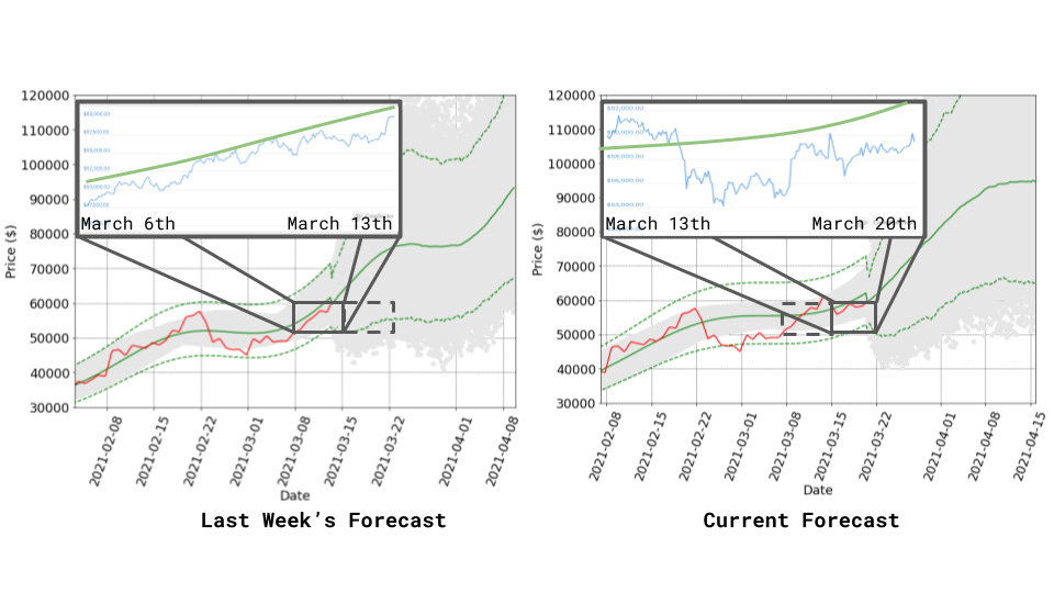
Last week, the forecast was quite bullish, the new fit appears equally bullish in the short term, and shows healthier conditions compared to last week, where we warned that a large correction after a euphoric rise could come in June. This still possible (and likely under the model), but it’s less likely this week than last week. I discuss a bit below the seemingly bi-polar nature of the predictions in the last few weeks. That said, nothing that has happened was unexpected, as we see we stayed well above the rising $50k-54k lower bound predicted last week.
There are macro factors that might be leading to some market indecision, or perhaps renewed long-term focus among the market participants. This week we learned that fed policies might be shifting to reflect economic recovery this year. I’m not sure of the short-term impact, but I imagine large investment institutions will be shifting their focus on hedging against too hot of a recovery. I’m not a macro expert, but I encourage readers to interpret this newsletter’s forecast in the context of the bigger environment.
Critical Date

This week’s forecast is a bit of an outlier compared to previous weeks. In particular, the predicted “critical date” — the date by which the model predicts the price stops rising exponentially (and likely corrects hard) — has moved dramatically later!
My personal read is this is an outlier, but could be the first indication of a “phase change” in market conditions where we might start to see a more steady, and healthy, rise in the coming year. We must wait for more price data before this is confirmed, and if that is the case, I will add another more appropriate model than the current LPPL bubble model. Under this scenario, the price might be better explained by a more standard asset appreciation model (like the “risk-free return” used in Black-Scholes), as we would no longer see super-exponential growth. Again, this is purely speculation and I will continue for the time being under the hypothesis that LPPL is a decent model. That said, is this model in general overly-optimistic?
Analysis: Is the Model Overly-Optimistic?
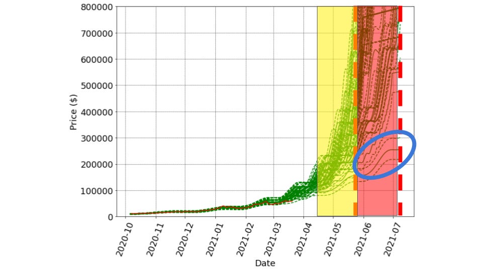
We’re using the LPPL model to model price action under the hypothesis that we are experiencing an asset bubble similar to bubbles formed by previous bull markets in Bitcoin’s history. However, this week’s forecast may be the first indication that “this time, things are different.” I warned readers about that phrase last week, and this week is no different. But let’s look at the data.
Above, I plotted previous predictions made over the past few weeks. As you can see, they tend to cluster with critical dates in the June timeframe. This was the basis for our discussion of the overly heated market scenario discussed last week. The blue ellipse above circles this week’s model fit (without the Monte-Carlo uncertainty model). This fit is clearly predicting something different from the others.
In general, the LPPL model is quite aggressive in its predictions. The reason for this is it models super-exponential growth:

This is the LPPL model for the price “p(t)” at time “t.” The critical date is “tc” in the above equation, since 0 < “beta” < 1, we obtain a singularity when tc>t, as we can not raise a negative number to a fractional power. As such, the most important term above is (tc-t)^beta, which is a power law. In our case, B<0, so the curve forms a dramatic bubble-like shape.
The rate of curvature change (the second derivative) of the above equation is most extreme as t approaches tc. This is clearly seen in a plot of the second derivative for A=0, B=-1,C=0, beta=0.2, and x=tc below:

Any fit will necessarily only capture the “flat part” of super-exponential growth until the data itself is clearly super-exponential. We are not yet in this regime, but the model keeps thinking it’s about to happen. So, the LPPL model is overly-optimistic and can be thought of as a worst-case (or some may say best-case) scenario of near-term super-exponential growth. In other words, LPPL provides a no earlier than (NET) model of bubble dynamics.
I’m going to continue tracking the LPPL model fit, but I’m starting to think about how to quantify whether the data supports “super-exponential” growth yet. This would look like parabolic growth on a log chart. In the past few months, the price has looked more like a line on a log chart, thus we are in “exponential” rather than “super-exponential” growth:

As soon as this pink line becomes parabolic for the log chart pictured above, then we’re in a better place for the LPPL model. In the meantime, LPPL anticipates the parabolic growth is about to start, and will probably keep thinking it will soon.
Once we do see parabolic action on the log chart, the LPPL model will become less “overly-optimistic” and will be a more accurate reflection of true growth. Next week, I might add a new “alternative hypothesis” that will be more pessimistic.
That’s it, Thanks for reading!
As always, your posts are super informative, easy to read and just fantastic. Thanks!!
Brilliant! I appreciate your explanation showing realistic probability