TL;DR Takeaways:
Pullback expected after a local top around $60k at the beginning of March. This has not changed since last week.
The bull cycle model predicts we will not go below $40k until this cycle is over with 99.73% confidence (3 standard deviations). If price breaks below this level model is invalidated.
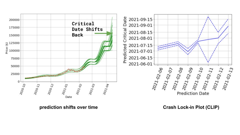
The predicted crash dates are moving further back as predicted, indicating the current price action is healthy. Current critical date bull cycle end is end of August 2021 (pushed back from end of June 2021 last week).
Other adoption analysis from @woonomic combined with my analysis suggests the fundamental price floor may rise faster than expected (possibly 90x price in ~5 years?).
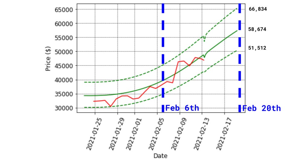
At writing time, the LPPL-autoregressive model predicts we’re at $47.2k, in the expected price range of $43.8k-$51.0k. The true price was $47.1k. The model predicts an expected price range of $44k-$56k tomorrow, and $51.5-$66.8k this time next week.
I would like to remind readers this post is a purely educational exercise. I’m fitting models based on data and am probably wrong. Don’t construe this analysis as investment advice, I am not an investment advisor and you should seek one out before making decisions with your money.
Analysis: Speculation Update
Last week, I introduced the idea of the various layers that contribute to the price of Bitcoin. In the current bull-run cycle, the price is dominated by speculation. Let’s start with some graphs and then some comments to build intuition about the chosen speculation model.
This past week has followed the previous week’s prediction fairly well. No one could have predicted Tesla converting $1.5 billion of their cash into bitcoin, but the boost looks totally expected in the longer-term model fit. It also appears there’s a strong psychological resistance right around €40k euros. The current prediction of a local top around the beginning of March is still in the cards.
Looking ahead to next week, the model predicts the price will continue going up! The 95% confidence floor will continue to rise before starting to flatten out after this coming week. The price appears to be stuck under a sell-wall, or resistance around $48k, so it’s possible the price moves sideways for a few days before catching up to the regression.
I’ve been re-running model fits every few days for the past week. How do the predictions change as new price data comes in? In the plot above and to the left, you can see all the predictions plotted together in green. In the short term they generally overlap, but as the forecast date moves further into the future they begin to diverge. Overall, the curves are shifting forward, indicating that the predicted “critical date”, of when the bull cycle will likely end, is moving further back. This is a well-known phenomena for the chosen model (see discussion below).
To visualize this directly, the plot above on the right is known as a “Crash lock-in plot,” or CLIP. This shows the date the prediction was made on the x-axis and the critical date on the y-axis. If we were approaching the real crash date, we’d expect the line to level out and the confidence bounds to narrow in. As expected for a healthy market, the prediction date is moving away to further dates. The model is quite optimistic, and until we are fairly close to the actual crash, the predictions can be thought of as “no earlier than” (NET) dates for the collapse. This will be an important chart to track moving forward.
A bit on the “critical date” and LPPL model intuition
I like to have some understanding about why models might work, and what they’re really telling me. Just like last week, we used a “Log Periodic Power Law” (LPPL) model to track the current Bitcoin bull run. I’m not the first to do this, I’m essentially copying a 2018 paper that does the same, and I recently found a blog post that used a LPPL model to predict the 2017-2018 collapse (they were really close!).
How can we tell the LPPL model is still valid? Like any model fit to data, a LPPL model is a hypothesis that price is caused by some underlying phenomena. Since I’ve calculated the standard error of the model, if the price drops below 3 standard deviations and stays there for more than a day, we can consider our hypothesis invalidated. This floor is currently $40k.
What does LPPL assume? The basic idea of LPPL is that there is a network of traders all essentially randomly buying and selling. There is a non-zero probability at any point in time traders all spontaneously sell, just by chance. However, if we assume traders are loosely copying other traders they are connected to (via social media) order can emerge, and the probability of selling suddenly can be higher than purely random and disconnected traders. This is known as herding behavior.
Modeling the herding behavior as a simple 2D grid (where neighboring cells interact with each other), we have the famous “Ising Spin” model from statistical physics. In order to build intuition about phase transitions going from order to chaos, it’s worth playing with this simulation of an Ising spin model. The takeaway is that through local coupling, global order can spontaneously emerge, and this transition from chaos to order resembles a phase transition. Like water suddenly turning into ice at the freezing point, the traders will all suddenly hit “sell” near some critical date.
In the LPPL model, we don’t assume a 2D grid, instead we consider a “Hierarchical Diamond Lattice” which better models the kind of network we expect when some people have more influence than others (think institutions vs. retail). When physicists say “lattice” they really mean a repeating grid-like network structure, so keep that in mind next time you need a fun fact to share at a (perhaps virtual) party.
So… we have this network of copy-cat traders, why does the price go up? Since we know the price could at any point spontaneously collapse, we take on some risk that the current price will move back to the price before the bull-run started (currently ~$11k). Every passing second, our total exposure to this risk increases, even if that probability is fairly low. Since our risk is increasing, “rational expectations” imply that the price must go up to compensate us for the risk we’re subjected to. This can be expressed by a differential equation, and solving for the price over time gives us the LPPL model.
Ok… why doesn’t the price go up forever? As the price goes up, we also assume that traders get a bit more anxious, anticipating the risk they’re taking on. As the price grows super-exponentially (“going parabolic”), the risk of a collapse also goes parabolic and eventually the collapse happens.1
So in short, bubbles form because there is a risk the bubble will collapse. The longer you’re invested, the more risk you take on the collapse will occur, so the price continues to go up. Eventually, the risk of collapse rises sharply and everyone decides to sell. We can’t predict precisely when this will happen, but we can know how susceptible we are to a spontaneous collapse. The date when a risk of collapse hits a singularity (rising impossibly fast) is known as the “critical date.”
Analysis: More on the Adoption model
Last week I introduced an adoption model based purely off of the price. Here are some more charts fleshing out that model, and a bit of a connection to some recent on-chain analysis by Willy Woo (@woonomic).
I love linear price charts of Bitcoin. The chart on the left shows the price floor in blue from 2014 to 2022. This is found by fitting the curve to the “dips” in Bitcoin’s price history. I’ve multiplied this price by 12 (orange line), which fits the 2017 peak. This is the basis for most $100k-200k predictions people have been putting out there.
Importantly, the adoption model looks like a logarithmic regression, but instead of the price going up forever, it eventually reaches a stable price. Plotting this model up to 2040 on a log chart (above right), we can form a familiar “rainbow chart,” but now with expected terminal prices. Depending on your beliefs about how volatility will play out in the future, the price could eventually range between these targets in the long term. In this scenario the price floor is at $355k, but then spikes due to supply shocks intermittently to the red, orange, or green lines. Fitting to the 2014 bull run, if that kind of volatility returned it implies we could shoot up to $13 million per coin intermittently. Looking at inflation adjusted price of gold charts2 gives credence to this hard money volatility.
Willy Woo (@woonomic) recently published an adoption curve on twitter. It implies we will gain 10x the number of users in 5 years. If these users are the same kind of users as before (as network participants and amount invested), Metcalfe’s Law model implies we should see a 100x price increase in that time. My fitted Metcalfe factor is a bit less (~1.95), implying a 90x increase, and the fitted factor from the 2018 paper (~1.75) implies a 56x increase in price from the current floor of about $10k. This implies ultimate price floors through adoption of $1 million, $900k, and $560k respectively. In the end, new adopters may have different impacts on the price (amount invested, holding patterns), so this extrapolation should be taken with a grain of salt.
Chunk of salt warning: The adoption curve fits don’t have enough price history to be trustworthy. However, unlike other models, these fits level off in price in the future, which we would expect if Bitcoin is fully adopted. In this way, I think the “rainbow chart” above makes s bit more sense in the long term than the logarithmic rainbow chart, but both are nice. The stock to flow model, for example, assumes the price continues to rise forever, and I think the rather huge long-term projections this is a downside to that model. However, in the short term the stock to flow model has been pretty spot on.
There’s a tiny chance the collapse doesn’t happen, and we level off in price. This outcome is necessary for mathematical reasons, maybe this can be our super-cycle hopium.
There are probably better references out there, this article is a bit critical of gold, but pointing out that it’s not immune to bubbles. I don’t believe this a bad thing fundamentally, volatility just seems like a fact of life for hard-money assets. If Bitcoin were used as hard-money, other stabilizing instruments could be added on top to make a stable derivative used for everyday transactions (imagine a coin based on Bitcoin futures that take this volatility into account).


